Apply UI/UX to a site
visual design| UX | | UI | Figma
Introduction
Welcome to our collaborative journey in ToBuy Shopping List Application! In this comprehensive study case, our interdisciplinary group will delve into the creation of an innovative web application designed to streamline and enhance the shopping experience. From the inception of the idea to the final implementation, we aim to cover every aspect of development, with a primary focus on delivering a seamless and user-friendly interface.

- Description |
- Tech plan |
- UI/UX plan |
- Challenges & Feedbacks
Description
Site Map | Wireframes | Moodboard | Mockup
Harmonizing Vision and Functionality: From conceptualizing user pathways with the site map to sketching simplicity through wireframes, crafting a compelling visual identity with the moodboard, and finally bringing designs to life via mockups, our holistic approach ensures a seamless and delightful shopping list application experience.
tech plan
db schema | php pseudocode | js pseudocode | file structure
Now we move on to this step, tech plan, in this step, we need to concern more about the backend create of the applicaton, in this step, our team meber in charge of frontend will co-laborate more with the backend member. We draw the structure connect tables for db schema, the physical model, we draft the php pseudocode and js pseudocode to give us a tracing road to follow prepare for coding. the file structure including folders file names for us to well organize the folders that for building our tobuy app.
- Start
- Accept user input for email, username, and password
- Validate input (ensure email is valid, username is unique, password meets criteria)
- Hash the password for security
- Save user information in the database
- End
User Registration:
- Start
- Select the HTML input elements
- Add an event listener to the "Add" button
- When the "Add" button is clicked, prevent the default form submission
- Create a new HTML div element to represent the to-buy item
- Create HTML elements for item details (li, buttons)
Add Item:
UI/UX Plan
Similer app ui|ux analyse
Conduct a thorough evaluation of the similar application's user interface and experience, identifying strengths, weaknesses, and areas for improvement.
01
- Categories and Sub-Categories: Competitor app provides a diverse range of pre-defined categories and sub-categories for users to choose from. Allows users to easily navigate through a well-organized structure for efficient shopping.
- Quantity Reminders: The app continuously reminds users of the quantity of items added to the shopping list. Helps users stay informed about their shopping needs, ensuring they don't miss anything.
- Product Icons for UI/UX: The inclusion of product icons enhances the visual appeal of the UI. Improves the overall user experience, making the app more engaging for users with different levels of education.
02
- Voice Input Capability: The search function allows users to access it through vocal input, offering an alternative to typing product names.
- User-Friendly for Diverse Audiences:more inclusive and user-friendly for individuals who may find typing challenging, such as those with varying levels of physical ability or different language backgrounds.
- Time Efficiency: Voice input significantly reduces the time it takes for users to add items to their shopping list.
- Intuitive Progress Tracking: The visual representation of a 5/24 and progress bar offers an intuitive and easily understandable way for users to track their shopping progress.
- Enhanced User Engagement:Users can quickly grasp how many items they've already shopped and gauge their progress towards completing the list, contributing to a user-friendly experience.
03
- Event-Specific Organization: Users can create separate lists for various occasions such as weekly groceries, special events, or holiday shopping.
- Efficient Weekly Planning: The capability to have multiple lists is particularly beneficial for users who plan their shopping on a weekly basis.
- Customized Store Visits: Users can create lists specific to different stores or locations, optimizing their shopping experience for each destination.
- Specialized Diet or Preferences: Users with specific dietary needs or preferences can benefit from creating lists tailored to those requirements.
- Task Delegation and Sharing: Multiple lists support collaborative shopping efforts, enabling users to delegate tasks or share lists with family members or friends.
04
- Tailored to Individual Preferences: Users can create categories and sub-categories with names that resonate with their personal preferences and lifestyle.
- Accommodating Diverse Product Needs: Users can customize item names, allowing them to include specific brand names, variations, or niche products not pre-listed in the app.
- Adaptable to Local or Cultural Terminology: Users can personalize categories and items based on local or cultural preferences, ensuring a more relatable and user-friendly experience.
- Easier Transition for New Users: Customization empowers new users to quickly adapt to the app by allowing them to organize items in a way that makes sense to them.
- Support for Specialized Hobbies or Collections: Users with unique hobbies or collections can create categories specific to their interests.
05
- Precision in Shopping Planning: Users can add specific details such as unit, quantity, and price, providing a precise overview of their shopping needs.
- Efficient Budget Management: By including the option to add prices to items, users can create a more accurate budget for their shopping trips.
- Enhanced Shopping Experience: Users can attach notes to each item, allowing for additional information such as brand preferences, quality considerations, or specific variants.
- Quick Reference for Subsequent Trips: Detailed product information becomes a quick reference for users during subsequent shopping trips.
- Customized Lists for Varied Purposes: Users can use detailed product information to create specialized lists, such as party planning or recipe-specific lists.
06
- Efficient Collaborative Planning: The share icon streamlines collaborative shopping by enabling users to share their lists with family or friends.
- Family or Household Coordination: Facilitates coordination within households, ensuring that everyone is on the same page regarding shopping needs.
- Event Planning and Hosting: Users can easily share shopping lists for events or gatherings, simplifying the planning process.
- Remote Shopping Assistance: This is beneficial for users who may need help from family or friends in selecting or purchasing specific items while shopping.
- Flexibility in Sharing Formats: Providing the option to share lists as PDF or Text caters to users with different preferences.
07
- Intuitive Task Management: The visual indication of completed items, such as a line across the product name, provides an intuitive way for users to manage their shopping tasks.
- Progress Visualization: Users can easily visualize their progress by quickly identifying completed items on the list.
- Reduced Cognitive Load: The visual indication reduces cognitive load by helping users instantly identify which items have been addressed.
- Enhanced Focus on Remaining Tasks: Users can focus on the remaining items to be purchased as completed items are visually distinguished.
- Improved Time Management: The "Mark Completed" feature supports effective time management by allowing users to quickly identify items they've already picked up.
- User Control and Satisfaction: Users have control over marking items as completed, contributing to a sense of agency and satisfaction.
08
- Personalized User Experience: The ability to modify language, currency, and other preferences in the settings provides users with a personalized experience tailored to their individual needs.
- Global Accessibility: Users from diverse geographical locations can customize the language and currency settings to align with their regional preferences.
- Enhanced Usability for Multilingual Users: Multilingual users can switch between languages seamlessly, allowing them to navigate and interact with the app in their preferred language.
- Cultural Sensitivity: The customization of preferences, including language and currency, demonstrates cultural sensitivity and responsiveness to users' cultural backgrounds.
- Adaptability to User Preferences: Users can tailor the app to match their preferences, creating a more comfortable and enjoyable experience.
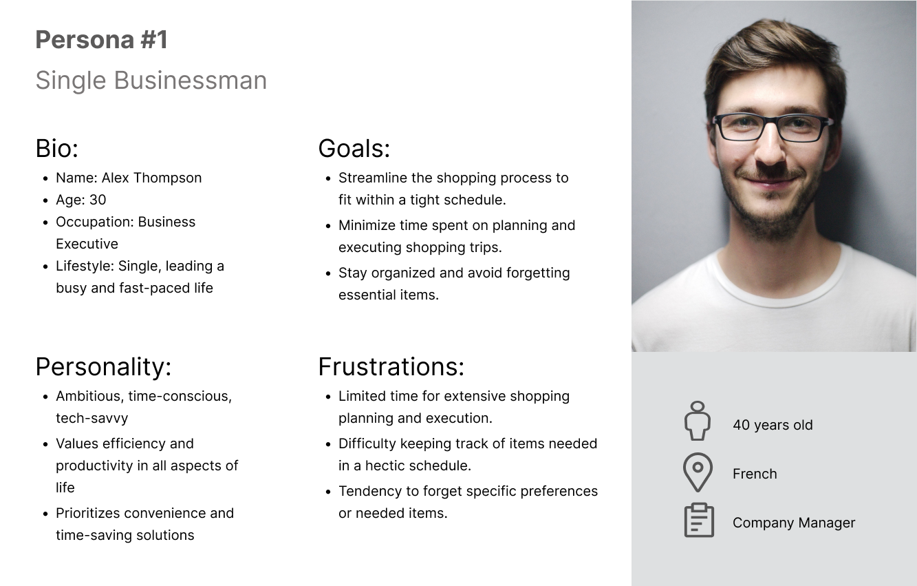
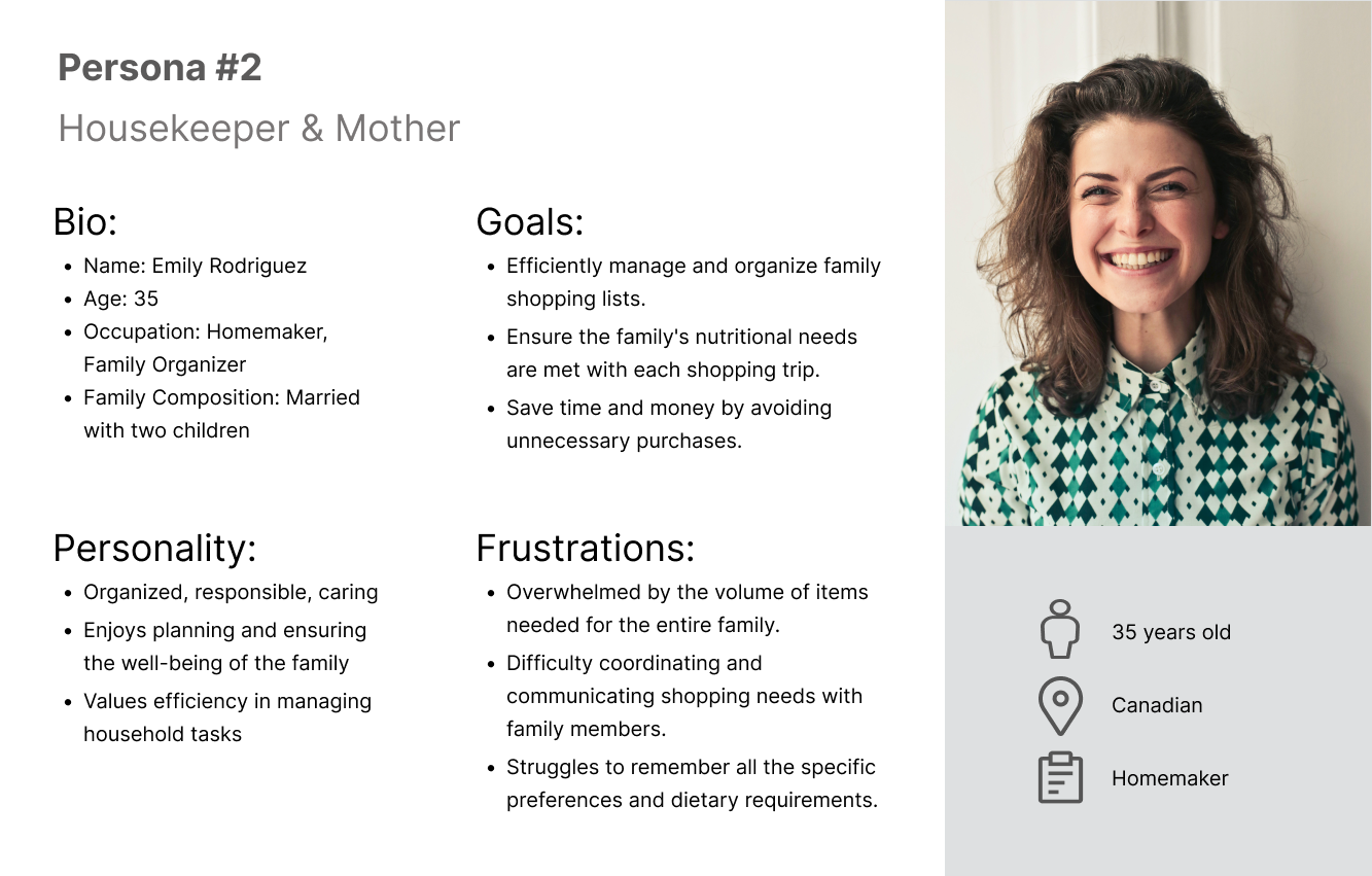
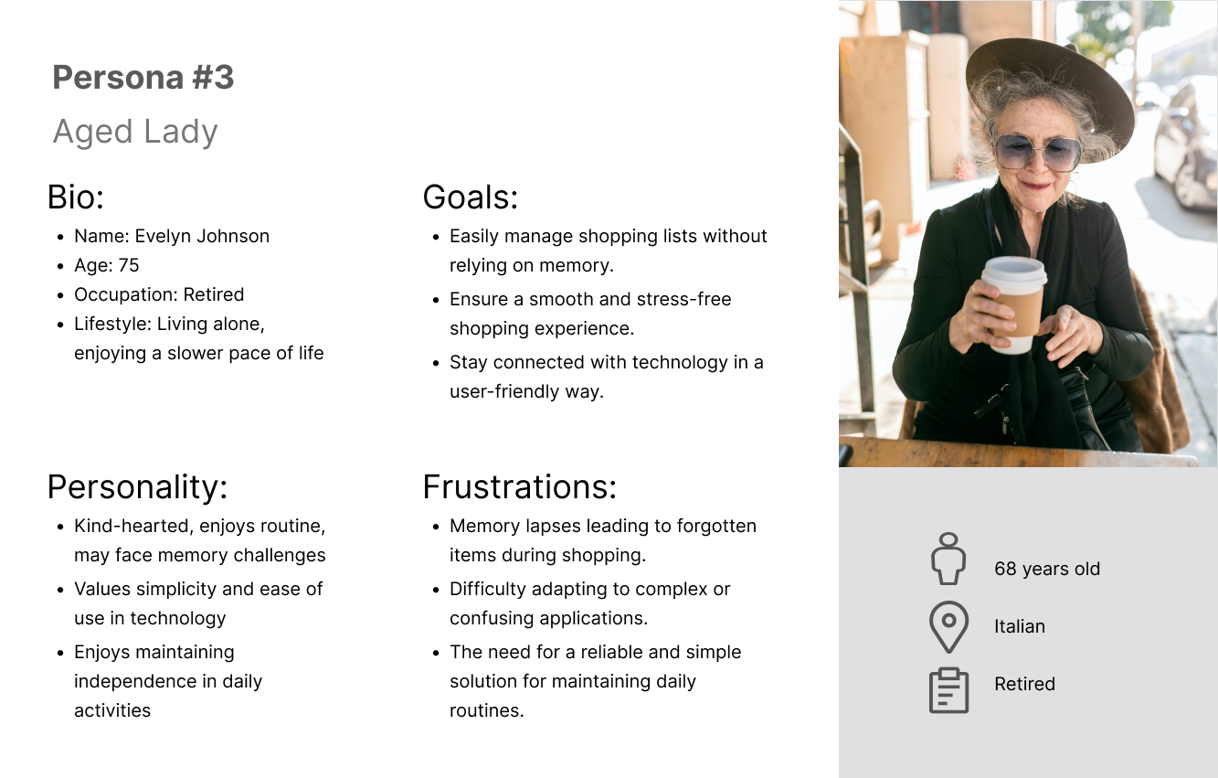
User personas
The personas section of this application provides a personalized and user-centric experience by allowing individuals to create and customize profiles based on their unique preferences, ensuring a tailored and efficient shopping journey.


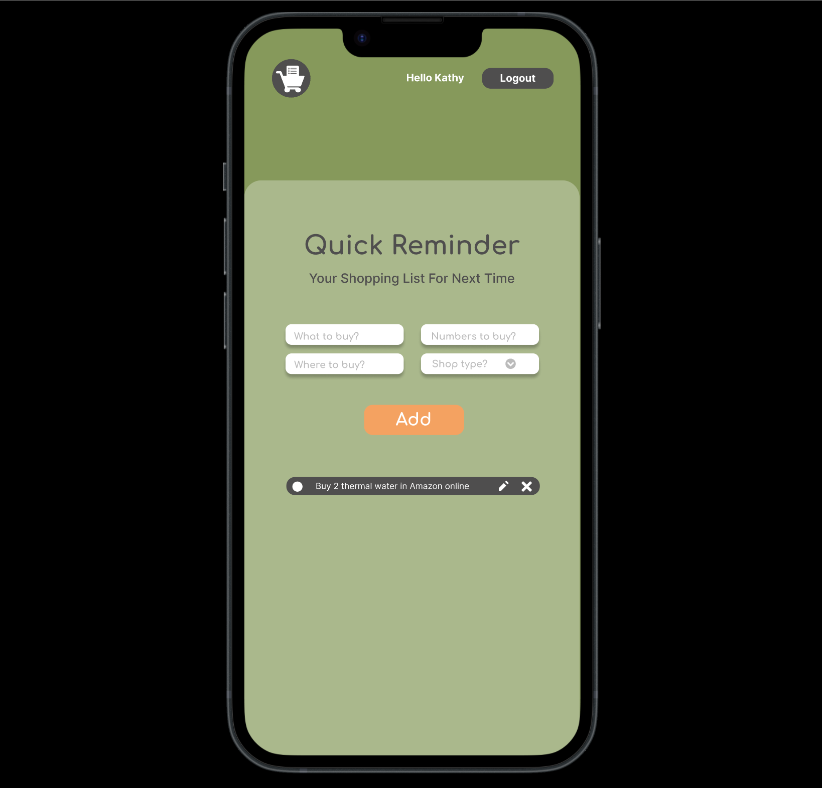
Interact prototype
Explore the seamless user experience of our ToBuy application through its Figma interactive prototype. could login logout, register, and mark complete, delete and edit your list.
Figma Update
Usability Testing Report: ToBuy Application
Introduction:
The ToBuy application underwent usability testing to evaluate its user-friendliness and overall usability, with a focus on addressing user feedback for enhancement.
Full Reportchallenge & feedback
The difficulty that we faced and the feedback from the other text users
- Mark product:When mark one item, if I update the product list, the marked one will turn to be unmarked